Causeway PDS delivers powerful 3D design tools that help civil design engineers, the software's primary users, produce the best possible designs.
PROJECT OVERVIEW
The brief was to design a new app icon for the Causeway Technologies PDS application, one that would draw on motifs from civil engineering and highway design while staying consistent with the Causeway brand's star-on-orange mark.
ROLE
Icon/Visual Designer
I developed and presented six icon concepts to stakeholders, then took the selected direction through to a final, production-ready icon.
I developed and presented six icon concepts to stakeholders, then took the selected direction through to a final, production-ready icon.
TOOLS
Adobe Illustrator.
THE OUTCOME
The icon was shipped with the PDS release.
DESIGN PROCESS & STRATEGY
Six concepts were developed across three colour directions, blue, teal and grey, each explored with two road-line treatments, to give stakeholders a genuine range of options rather than minor variations on one idea. The greyscale direction was ultimately selected as it sat more neutrally alongside the other Windows Start-screen tiles without competing with their accent colours, and the final icon was tested in context on an actual Windows Start screen to confirm it held up next to the OS's other app tiles before sign-off.
Causeway PDS Icon Concepts
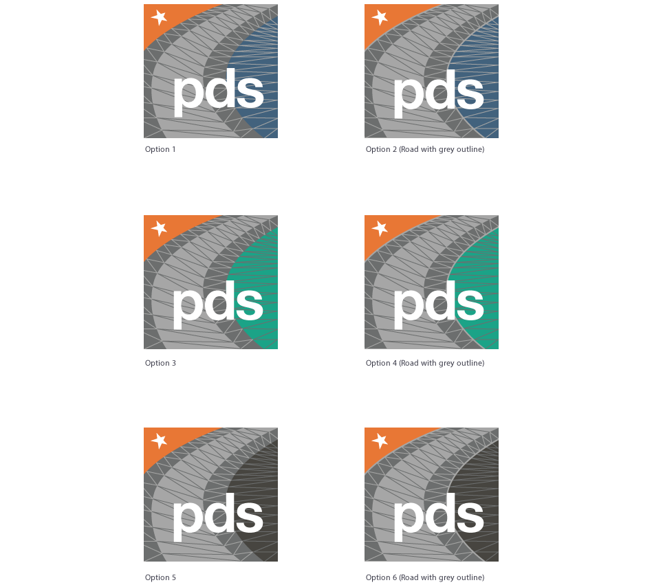
Six icon concepts were developed across three colours, blue, teal and grey, each with a plain and grey-outline version of the road motif, giving stakeholders real options to compare rather than small variations on one idea.
Causeway PDS Final Icon

The final icon, chosen from six concepts for its neutral greyscale treatment alongside other tiles, while the orange star corner keeps a consistent link to the Causeway brand.
PDS Icon on Windows Start Screen
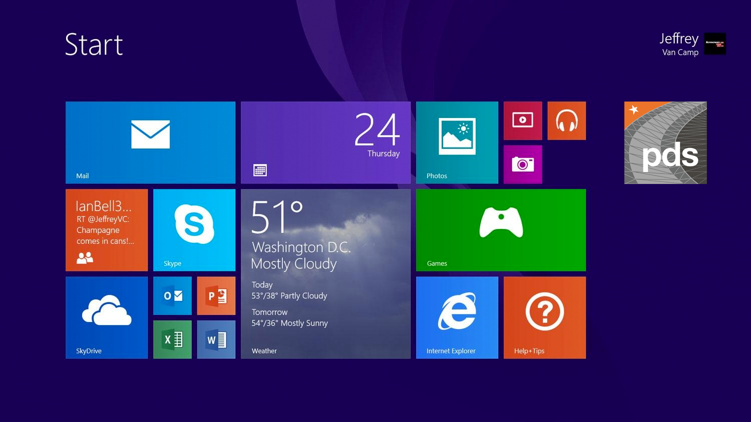
The final icon tested in its real environment, the Windows Start screen, to confirm it held up visually next to the OS's other app tiles and the bright colours used across them.