I led the wireframing and hi-fi design, and maintained the design system for two years.
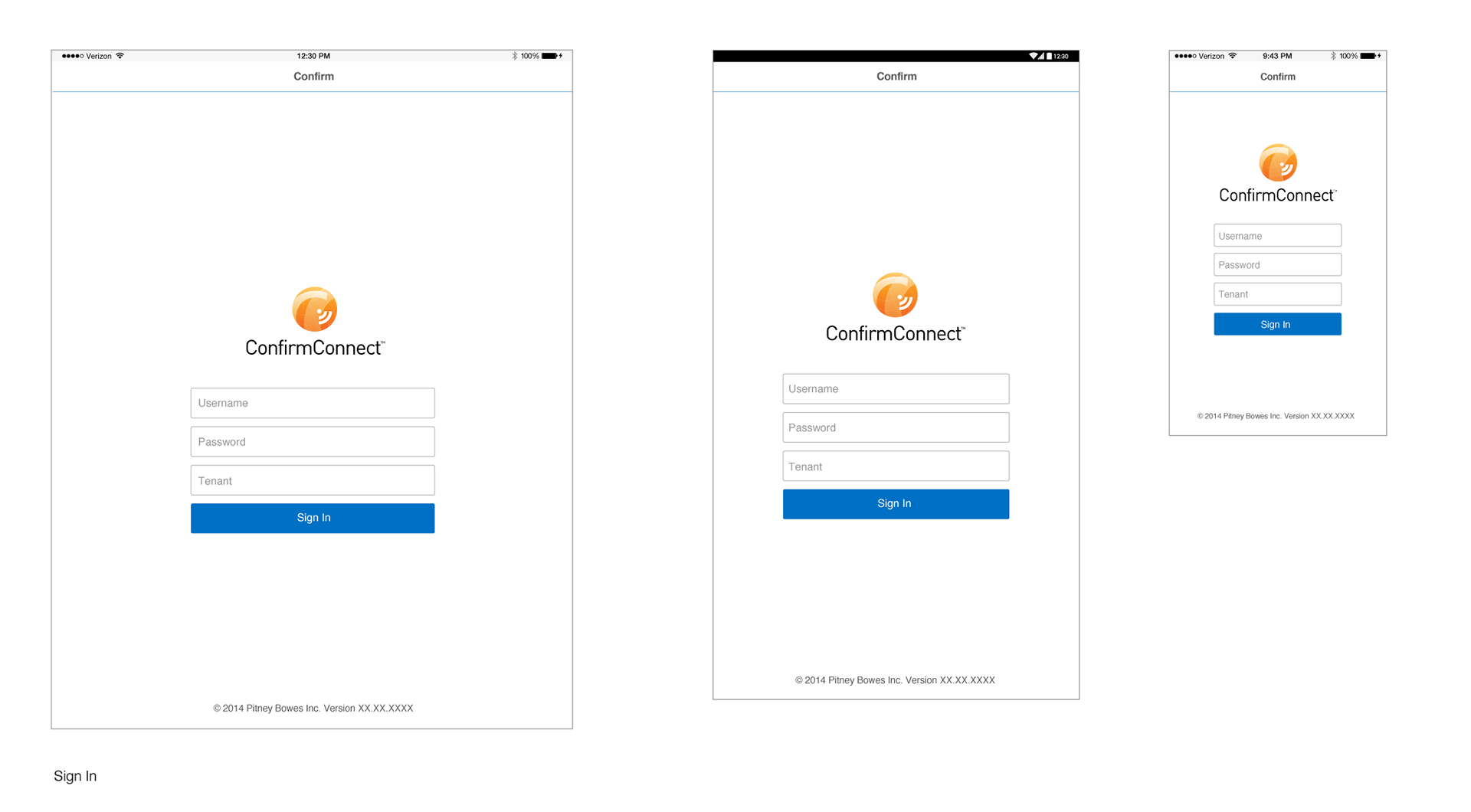
The Sign In screen implemented across three device sizes. The layout stays consistent (logo, fields, button, footer) but repositions to suit each screen: on the smaller phone screen the logo sits above the fields with less surrounding whitespace, while the larger tablet layouts push the form lower and center it with more breathing room.
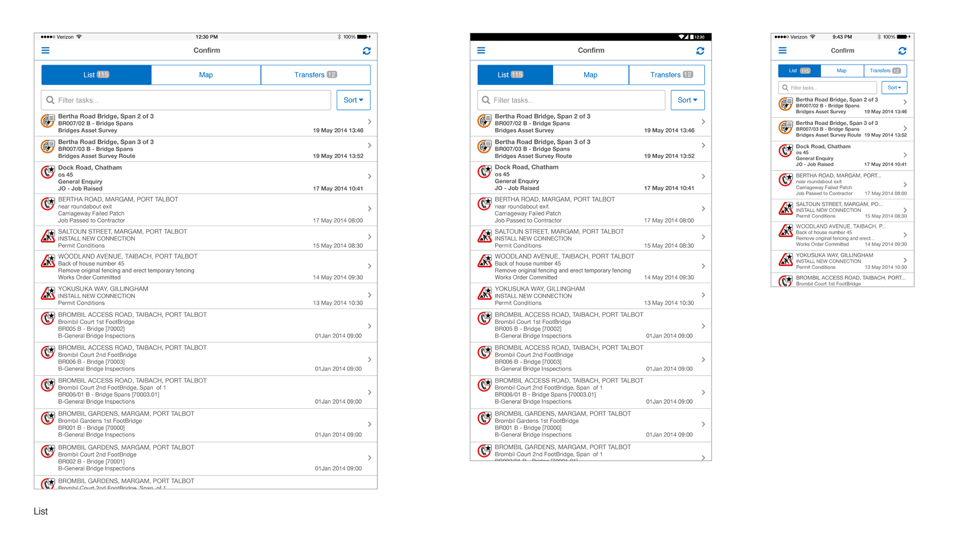
The task list implemented across three device sizes, showing real field-inspection tasks such as bridge asset surveys and permit conditions. The tablet layouts keep the full list format with generous spacing, while the smartphone version compresses row height and hides less critical detail to fit the smaller screen without losing the colour-coded status icons.
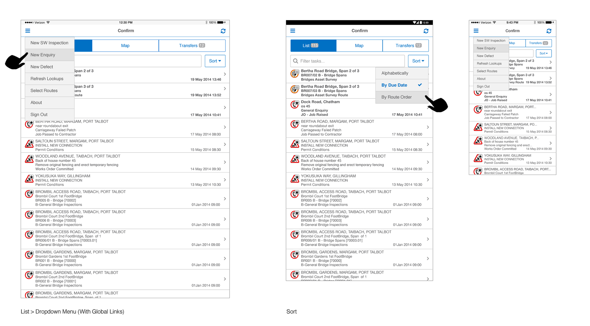
The global navigation menu and the task list's sort menu, shown open across all three device sizes. The pointer callouts highlight which control triggers each overlay, and the menu options themselves (creating new inspections, enquiries and defects) confirm this is the primary way field workers start new tasks from anywhere in the app.
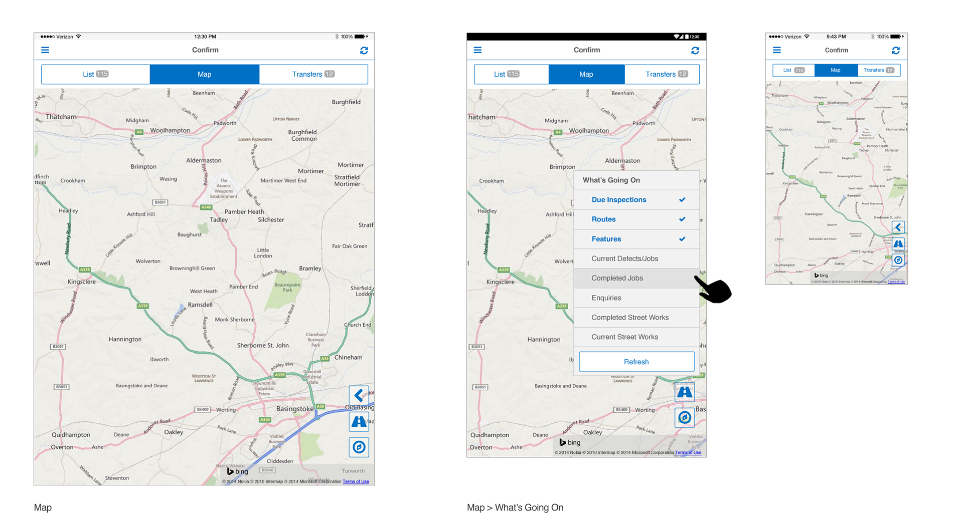
The map view plots field routes and lets inspectors toggle which data layers are visible, such as due inspections or completed street works, through the "What's Going On" menu. On the smartphone, the same map and layer controls are condensed into compact icon buttons along the right edge to preserve screen space.
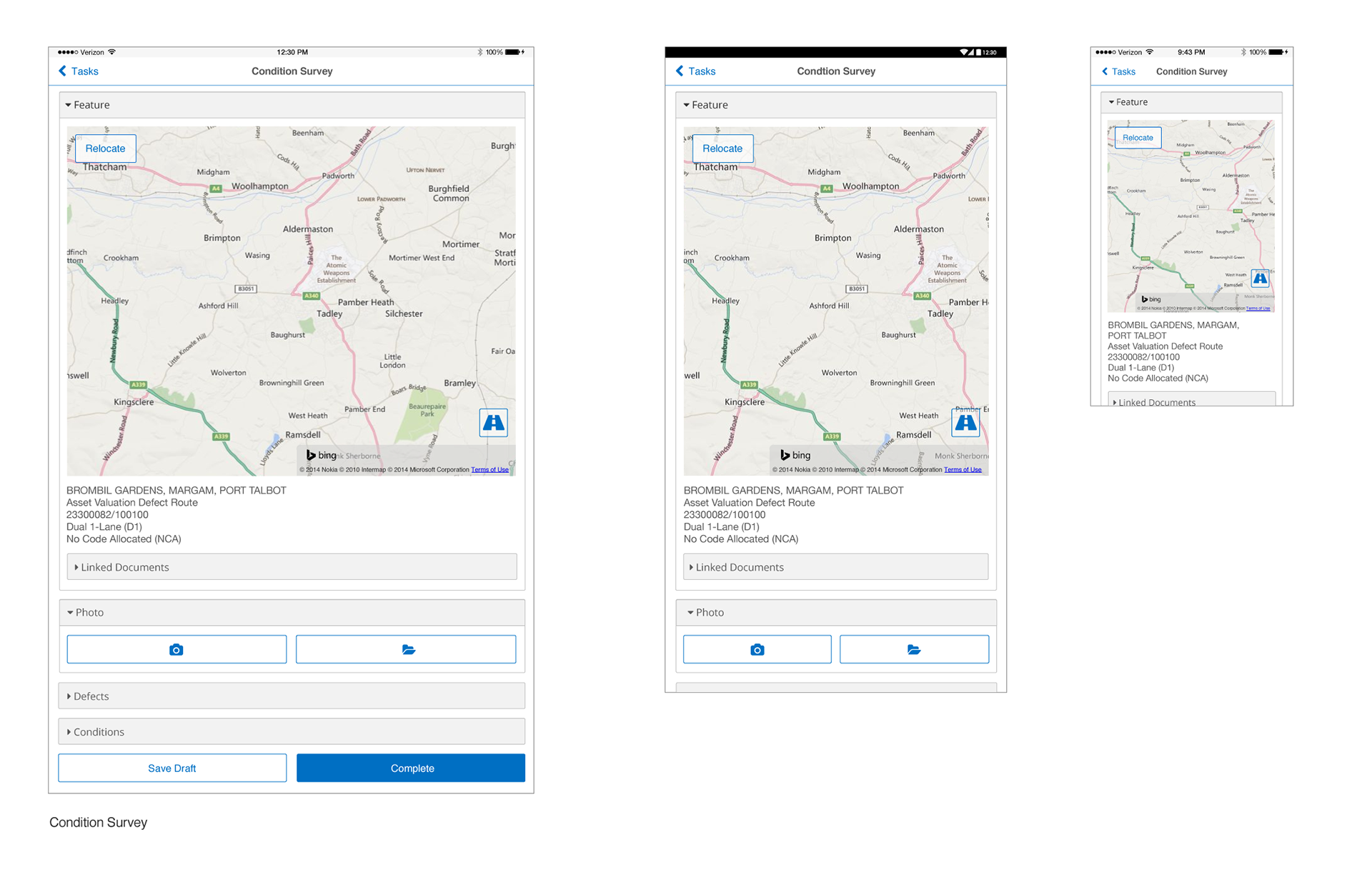
The Condition Survey screen where field inspectors log an asset's location, attach photos and record defects before submitting. The collapsible section pattern (Feature, Linked Documents, Photo, Defects, Conditions) keeps a data-dense form manageable on the smartphone, where most sections collapse by default to fit the smaller screen.