OVERVIEW
Garrett's existing icon set lacked any visual cohesion to the brand identity when implemented on various touch-points and this was evident in the inconsistent styles in motifs, outline, solid fill, sizes, colors, and stroke widths.
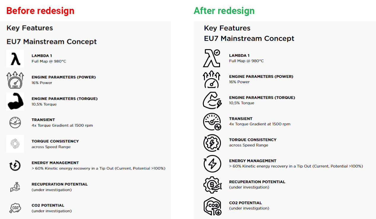
The icons also presented user experience challenges as they were in PNG format, lacking scalability and quality was compromised when viewed on high-definition displays (including retina based mobile screens).
TIME
9 months
ROLE
UX Strategy Lead
Conducted in-depth research and analysis to understand user needs and market trends.
Conducted in-depth research and analysis to understand user needs and market trends.
Creative Art Direction
Led creative direction and visual aesthetic of icon library and provided constructive feedback and guidance to UI Designer to ensure quality and consistency across all deliverables.
Led creative direction and visual aesthetic of icon library and provided constructive feedback and guidance to UI Designer to ensure quality and consistency across all deliverables.
OUTCOME
The updated icon set now offers three distinct sizes tailored for Illustration, Application, and Functional categories (128px, 64px, 16px) and can be conveniently downloaded as SVG files from Garrett's Digital Asset Manager portal.
The icons seamlessly blend into different Garrett brand platforms, ensuring consistency and reinforcing the brand's visual identity. They elevate Garrett's digital presence with a modern and memorable design, aligning perfectly with current minimalist trends.
END-TO-END DESIGN PROCESS
1. Project Initiation and Planning: Defined project scope and strategy for creating the icon library.
2. Research and Strategy: Conducted user research and collaborated with UI Designer on defining iconography strategy.
3. Direction and Oversight: Provided guidance and ensured alignment with project goals throughout the design process.
4. Design Execution and Iteration: Delegated tasks and facilitated iterative design reviews for quality assurance.
5. Testing and Validation: Coordinated usability testing and analysed feedback for refinement.
6. Documentation and Guidelines: Documented finalised designs and developed comprehensive usage guidelines.
7. Implementation: Integrated icon library into digital products while ensuring adherence to design standards.
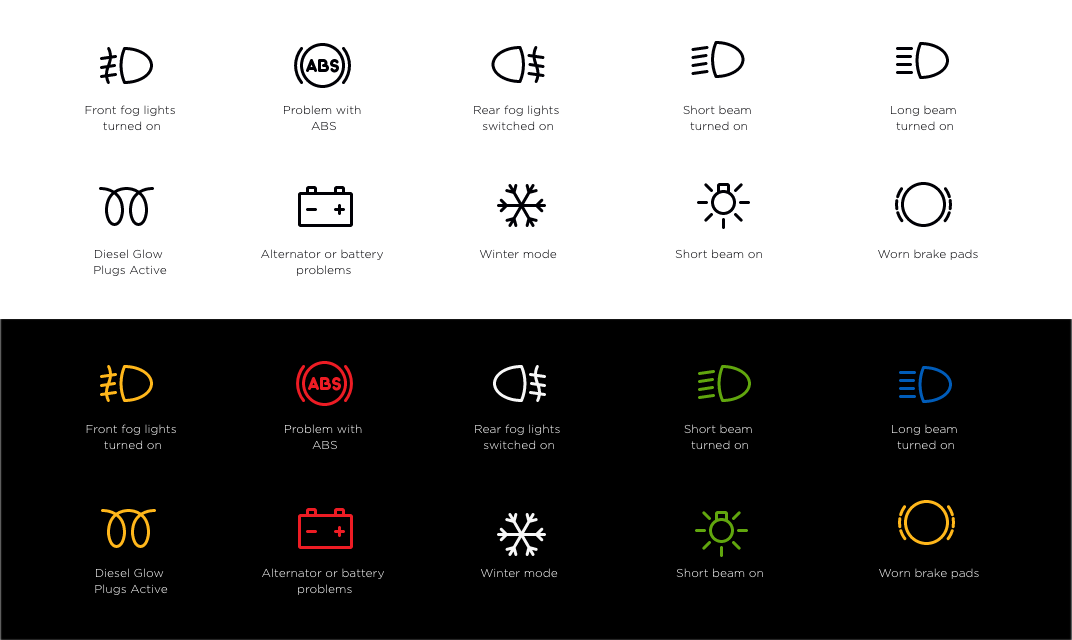
The previous Garrett icons had inconsistencies in motifs, outline, solid fill, sizes, colors, and stroke widths
New icon designs - Illustration category
Used on Garrett Motion website, social media, video presentations (black and red stroke)
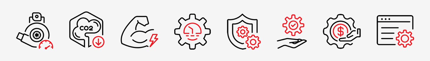
New icon designs - Application category
Used on desktop screens (black monochrome)
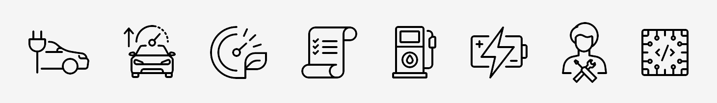
New icon designs - Functional category
Used on web/app where a smaller icon is required, e.g. navigation menu, mobile app (black monochrome)

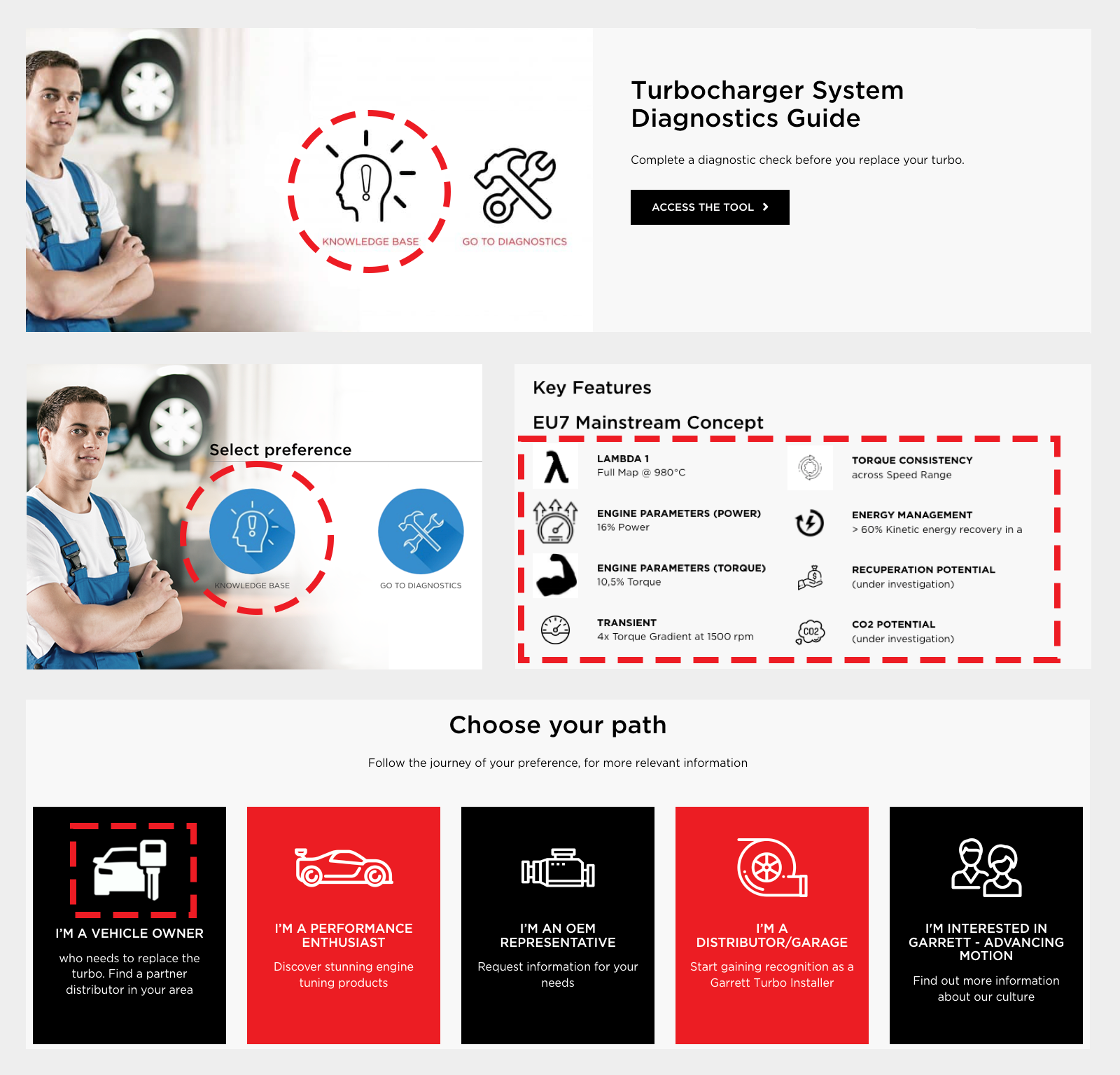
New icons used for Connected Vehicles Webinar