2. Competitor Analysis: Evaluated industry-standard search features to establish baseline UX requirements and feature gaps.
3. Design Phase: Designed wireframes in Adobe XD with a focus on usability, accessibility, and responsiveness across different devices. Incorporated elements such as search bar placement, auto-suggestions, filtering options, and result presentation.
4. Feedback & Iteration: Gathered feedback from the product owner on the initial designs and iterated on the design to ensure alignment with project objectives.
5. User Testing: Ran usability tests with key end-users to validate navigation flow and correct usability issues.
6. Front-End Handoff: Worked alongside developers to implement responsive components and verify technical compatibility.
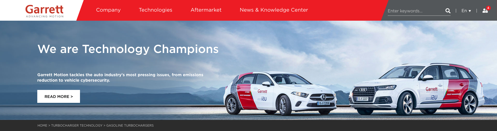
Garrett homepage with a redesigned search bar, positioned prominently in the global header to encourage instant user discovery.
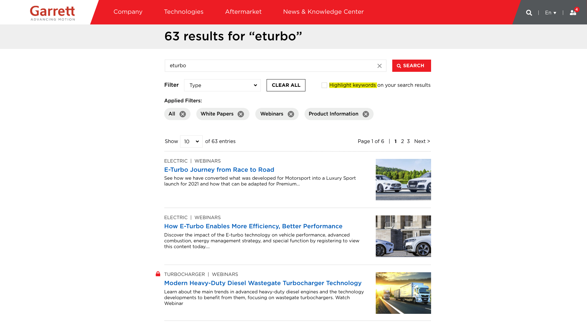
Garrett redesigned search with prominent result notification, filtering by type, an option to highlight keywords, and intuitive results showing content type alongside a large thumbnail image.
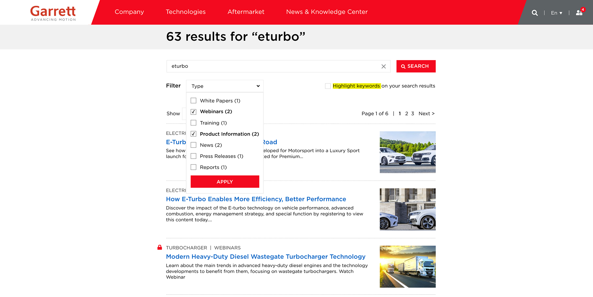
Garrett redesigned search with a filtering by type menu, letting users narrow the 63 results by content category, such as webinars, white papers, or product information, with counts shown for each.
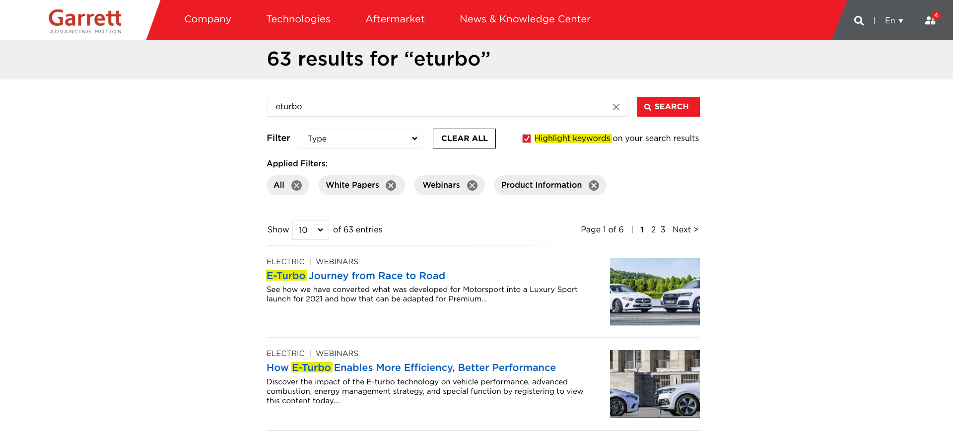
Garrett redesigned search with an option to highlight keywords, making it easy to spot the "eturbo" search term directly within the titles of matching results.

Garrett redesigned search with related searches, suggesting alternative terms so users can quickly refine or broaden their query beyond the original "eturbo" search.
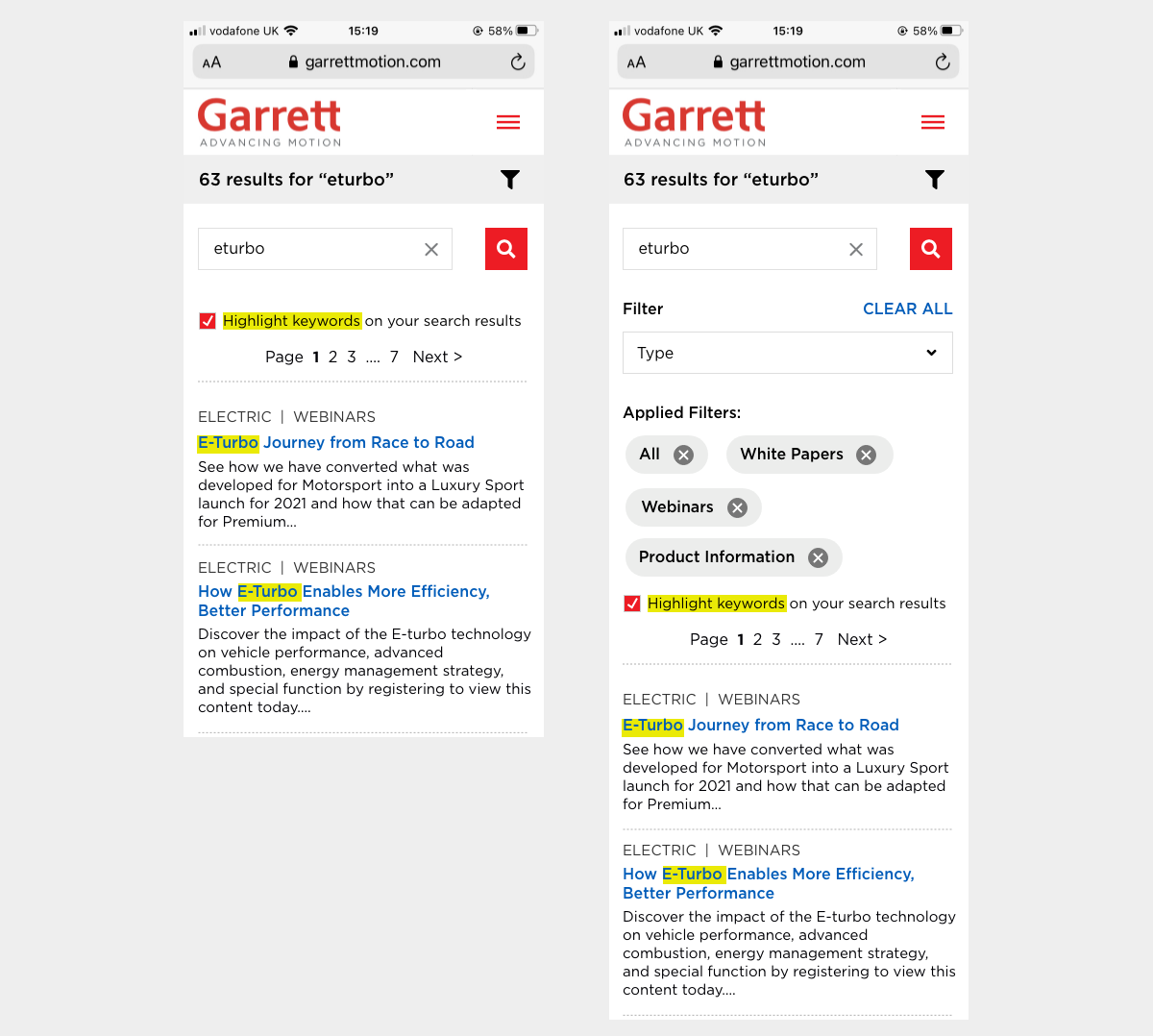
Garrett redesigned search with filtering applied on mobile view, showing the collapsed filter icon alongside the expanded filter panel with applied tags and highlighted keywords.
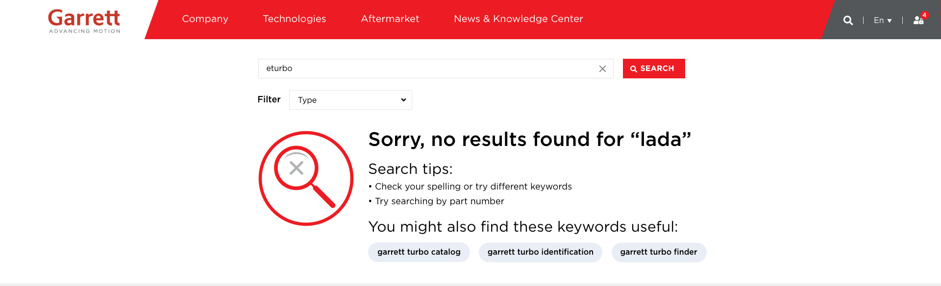
Garrett redesigned messaging when no search results are found, pairing a clear empty state with helpful search tips and suggested keywords to guide users toward a successful search.

Garrett redesigned 404 message page with a customized image, replacing the "0" with a magnifying glass icon and pairing it with a full footer of navigation links to help users find their way.