I led the wireframing and hi-fi design, and maintained the design system for two years.
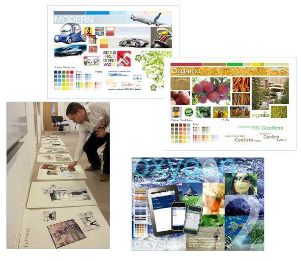
Early moodboard directions explored for the Confirm brand: Modern, Organic and Oxygen, each paired with its own colour palette and typography. Printing the boards full-size made it easier to lay them out side by side and compare directions before settling on the final visual language.
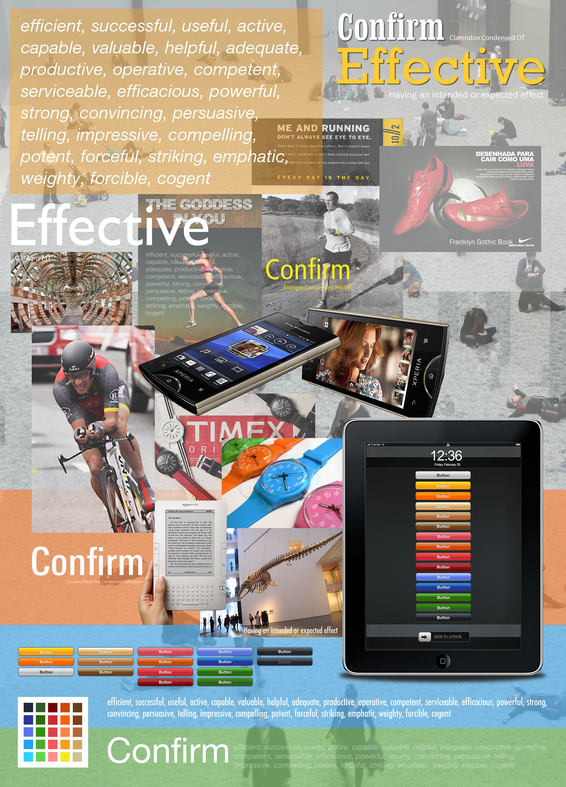
This board explored "Effective" as a brand attribute for Confirm, pairing a set of related keywords with candidate typefaces (Clarendon Condensed, Frutiger Condensed, Univers Next Condensed) and reference imagery chosen for its sense of performance and precision. The colour palette and button styles shown here fed directly into the UI screens developed later
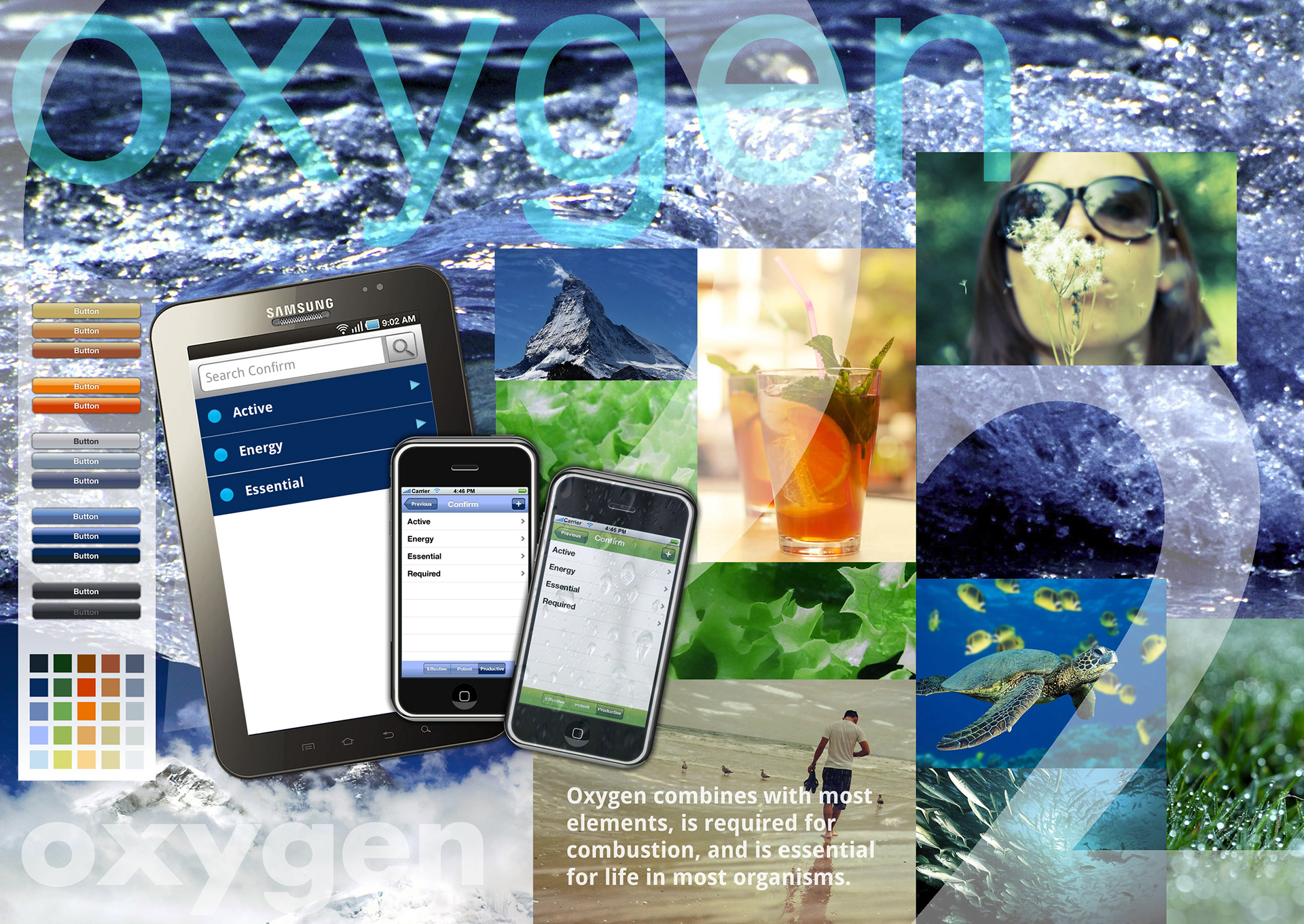
This board explored "Oxygen" as a brand attribute, built around the idea of something essential and life-giving. Water, nature and refreshment imagery set the tone, while the app mockups test how attribute words like Active, Energy and Essential could surface directly in the product's navigation, alongside the cooler blue-grey palette this direction proposed.
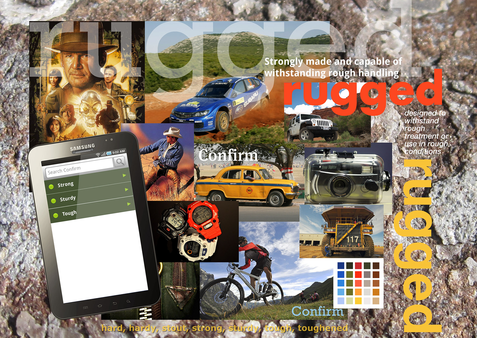
This board explored "Rugged" as a brand attribute, drawing on imagery associated with durability and rough conditions: off-road vehicles, outdoor gear and industrial equipment. As with the other directions, the reference imagery is paired with an app mockup testing how the attribute words (Strong, Sturdy, Tough) could work as menu labels, plus a proposed earth-toned colour palette.
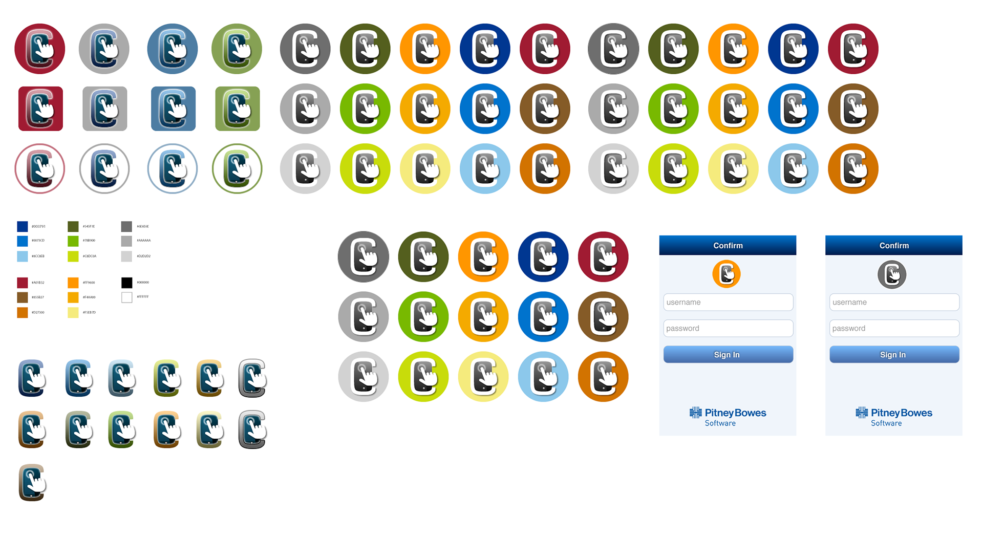
More than 40 colour and shape variations were produced for the ConfirmConnect app icon, combining a "C" mark with a hand icon to reinforce the app's touch-driven interaction. Two of the strongest candidates were then tested directly on the Sign In screen to judge how each performed at a small size and against the Pitney Bowes brand colours before a final direction was chosen.

The final ConfirmConnect mark, selected from the earlier round of concepts. The orange sphere keeps continuity with the parent Confirm brand colour, while the added signal icon distinguishes ConfirmConnect as the connected, mobile-first product in the family.
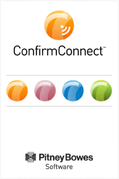
The splash screen introduces ConfirmConnect within the broader Confirm product family, represented by the row of four coloured spheres, one per product, while keeping the Pitney Bowes Software logo present for brand consistency across the suite.
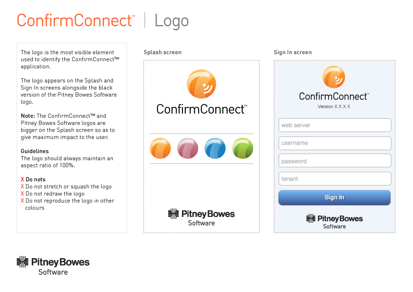
This page from the ConfirmConnect style guide sets out how the logo should and shouldn't be used, including aspect ratio, placement relative to the Pitney Bowes Software logo, and explicit "do not" rules to prevent misuse as the brand was rolled out across the app's screens.
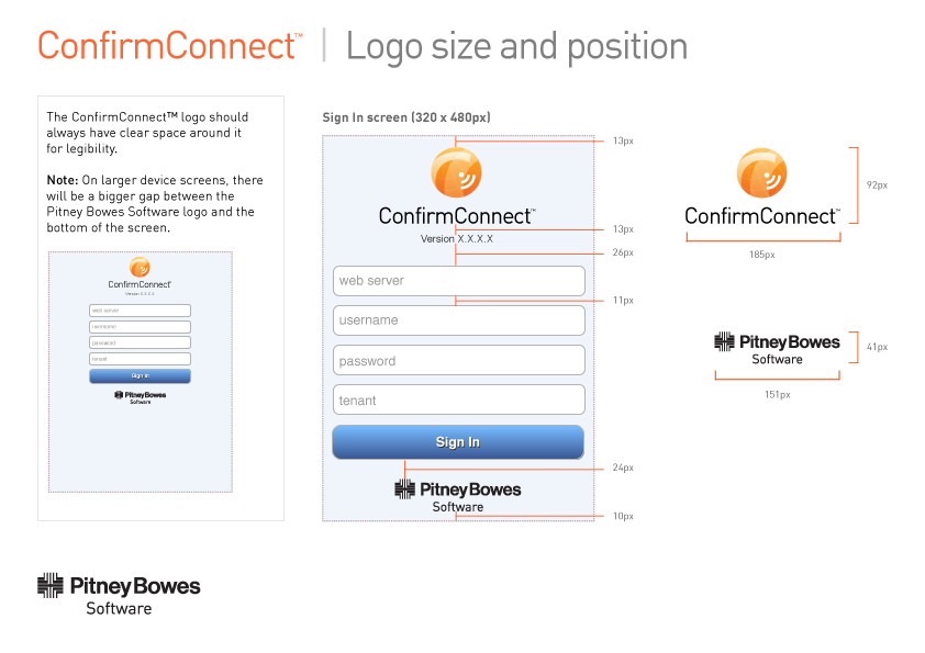
This page defines the precise spacing and sizing rules for the logo on the Sign In screen, down to the pixel, so that developers could implement it consistently and the note about extra clear space on larger devices shows the guide was built with responsive layouts in mind from the start.
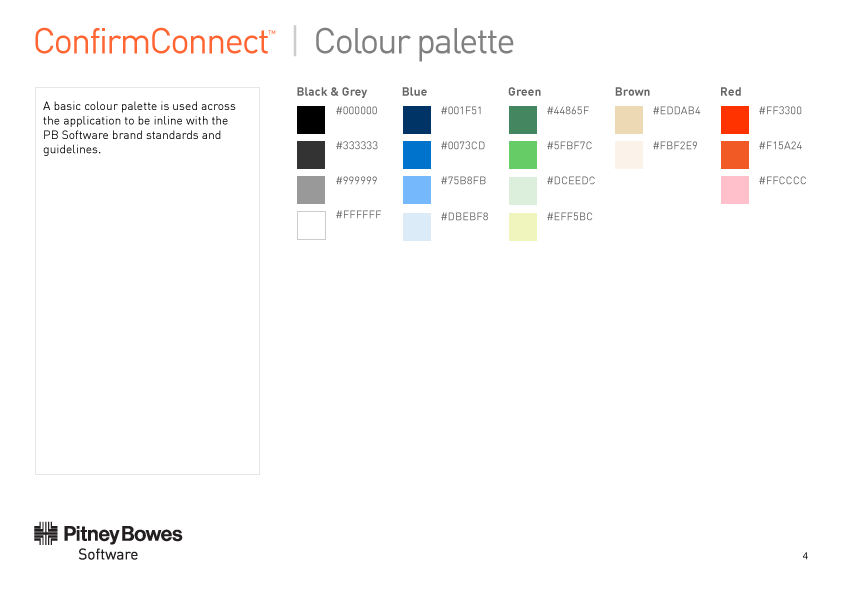
The full colour system used across the ConfirmConnect app, organised into five families with exact hex values for each shade. Keeping the palette aligned to Pitney Bowes Software's existing brand standards, rather than introducing new colours freely, kept ConfirmConnect visually consistent with the rest of the product suite.
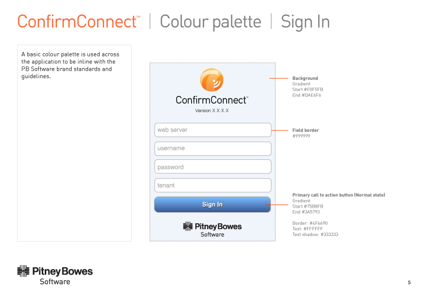
This page shows the colour palette applied directly to a real screen, specifying the exact gradients, borders and text treatments needed to reproduce the Sign In button and background consistently, down to the text shadow colour, so developers had no ambiguity when building the screen.
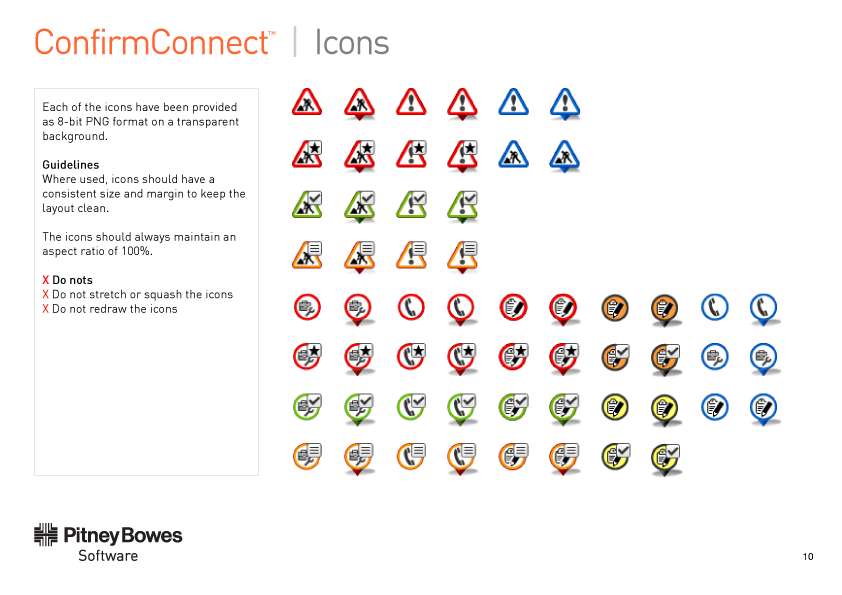
The icon system defines a consistent visual language for status and task types across the app, using colour to distinguish states (for example red for alerts, green for completed) while keeping shape and format fixed. As with the logo, explicit "do not" rules were included to prevent icons being redrawn or distorted as the app was built out.